Costco Photo Centre Accessibility
Costco Canada Photo Centre is a site where members can order prints and other photo products. Their offices are in Ontario, so they required conformance with the Accessibility for Ontarians with Disabilities Act (AODA). Since then, the federal government published new legislation, the Accessible Canada Act (ACA), making accessibility an even bigger priority for Costco Canada.
My role: Lead Product Designer, Manager
A great but insufficient beginning
PNI started making efforts by evaluating the site with automated validation tools and allocating time for developers to fix issues with code alone. However, I knew that making the site genuinely accessible would take much more than that.
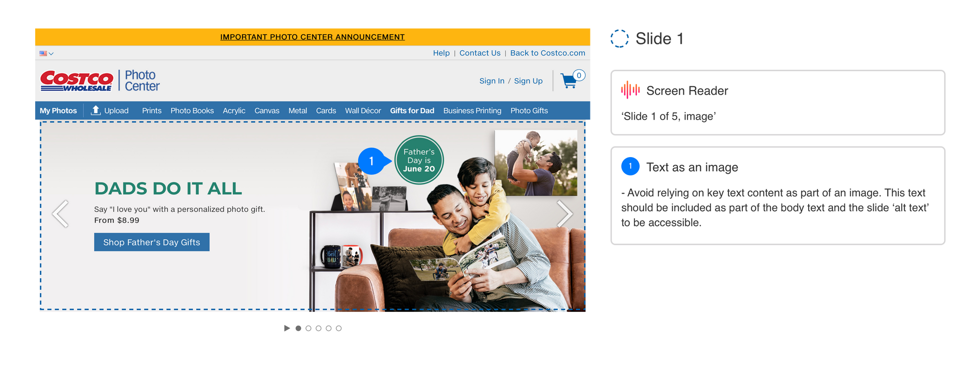
The more I learned, the more I knew that relying on these automated validation tools would only provide surface-level feedback and might miss many accessibility barriers or throw false positives. So, to better understand the site’s accessibility conformance, I created a test plan for the design team that combined both usability testing and manual accessibility testing.
Making a plan to enact progress
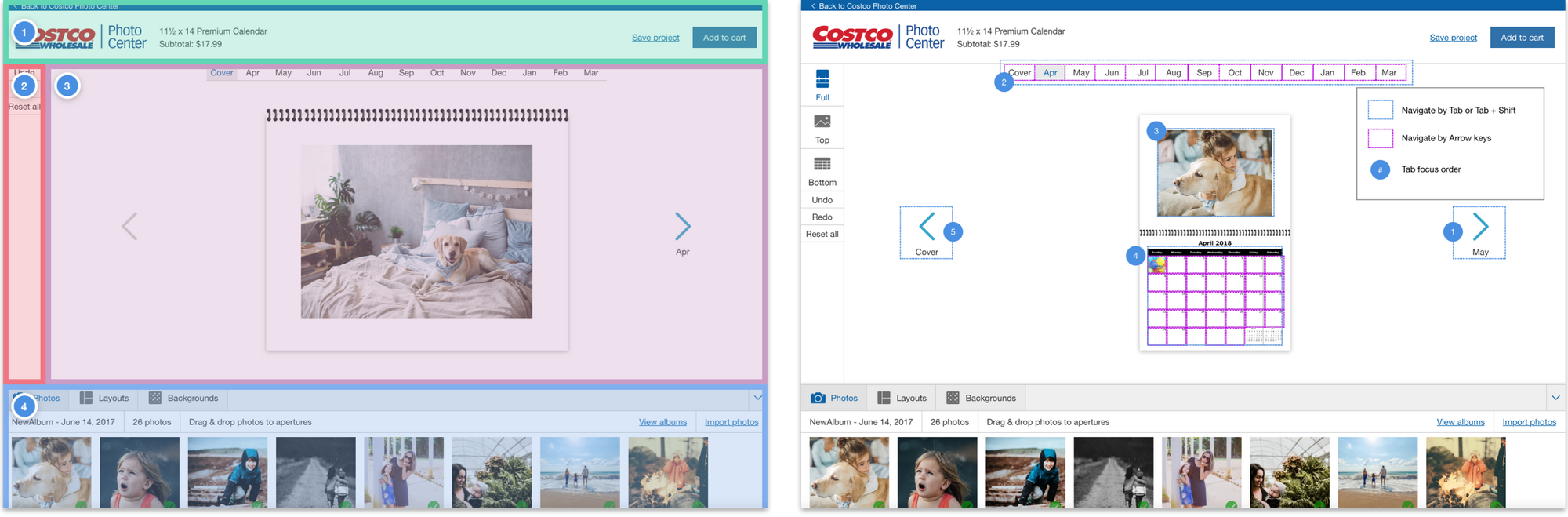
First, I looked at the top user flows throughout the site and directed designers to conduct unmoderated usability testing to understand users’ most significant pain points and issues. Next, I planned specific scenarios to test with participants, allowing us to record usability and accessibility issues.
Then we proceeded to conduct comprehensive manual accessibility reviews by pairing both heuristic evaluations and cognitive walkthroughs. These evaluations allowed us to test the interface against Web Content Accessibility Guidelines (WCAG) criteria while also testing against specific tasks in the way that users of assistive technology would.
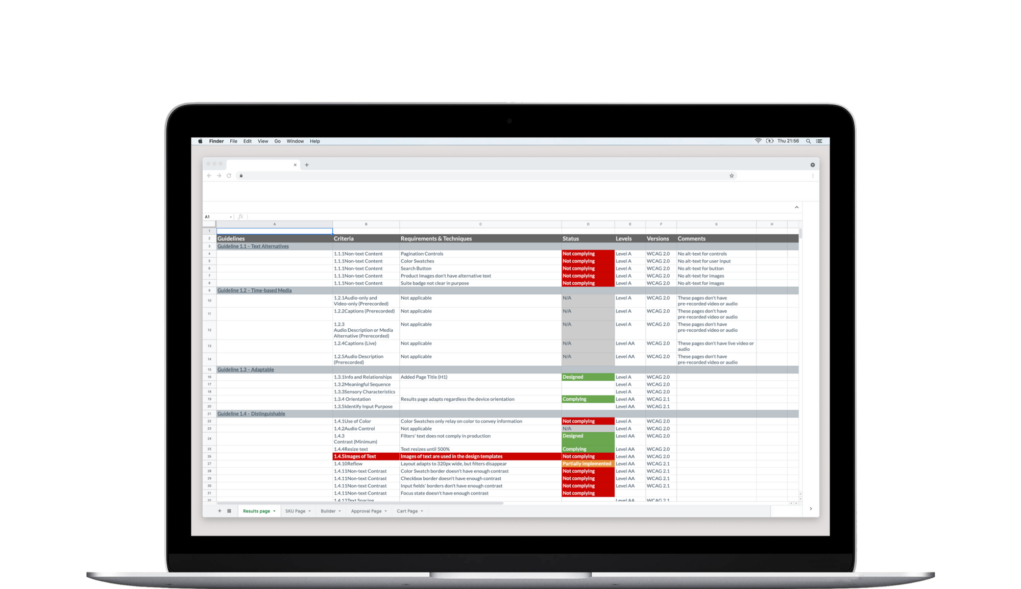
Our findings were summarized and shared with Costco’s stakeholders, and I provided high-level prioritization so that the design and development teams could work on it. I did this by taking into consideration multiple factors, including:
- The severity of the issues: Issues that had the potential of blocking users from performing the page’s purpose were high. Issues that didn’t block users but might cause frustration were medium. And issues that were not complying but may not pause a blocker or an annoyance were low.
- Their impact: Based on data, I prioritized pages with core content or functionality, high traffic, or had products that are the biggest sellers.
- The flow: I prioritized top-of-funnel pages as they often have static content that can be fixed quicker, and they are the starting point in the customer’s journey.
This roadmap gave us a backlog of accessibility and usability issues that the teams will remediate.
A site without barriers does not mean it’s easy to use
With this new understanding of the site, we knew that we couldn’t address everything by just writing clean code. Truly accessible sites need to be designed that way. An excellent example is when users can navigate sites using the keyboard without blockers or keyboard traps, but the sequence is cumbersome and takes them a long time to get to where they want.
Results
- A roadmap with clear prioritization to resolve known accessibility issues in Costco Canada Photo Center.
- The design team created templates for audits and other design documentation specific to accessibility.
- I partnered with HR in creating training modules available to all employees at PNI.
- I created training and learning opportunities in the design team, like writing a test plan for people who use assistive technology.
- Since working on this, Costco US has also become interested and requested that we prioritize the site’s known issues.