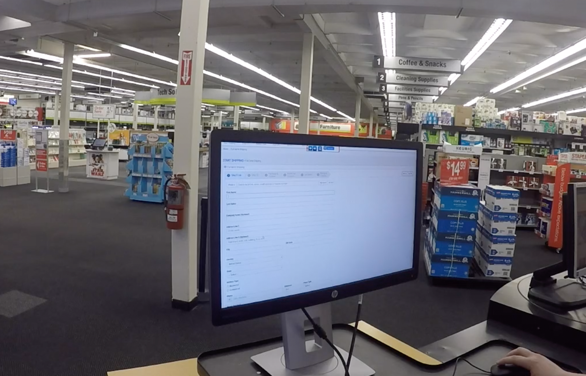
Staples In-Store Shipping Platform
Falcon is PNI’s first shipping solution; it allows retail stores to offer shipping and drop-off services to their customers. It is a multi-carrier solution that provides customers with the best rate available for their shipping needs.
My role: UX Designer, Individual Contributor
The Goal
To replace a third-party legacy tool that was being used in Staples stores to create shipping labels.
Pain Points & Challenges
Based on interviews with multiple stakeholders and store managers, I identified these as the main pain points and challenges to solve:
- The UI was complicated; it lacked linear process, instructions, and feedback.
- Training and expertise took a long time.
- Needed to match existing features
Design goals
Based on that, these were the goals I set for the design:
- To decrease training time
- To design for multi-tasking
- To create a platform that was client and carrier-agnostic
- To design for scalability
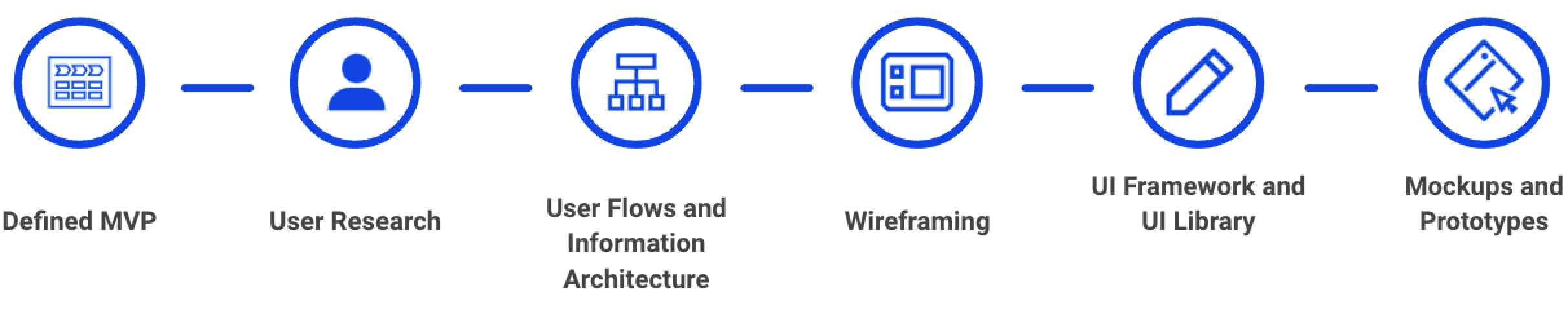
Process
The business wanted to release the MVP within 6-8 months. Below you can see a quick overview of the UX and UI tasks and artifacts I delivered working in two-week sprints:
Understanding the flow
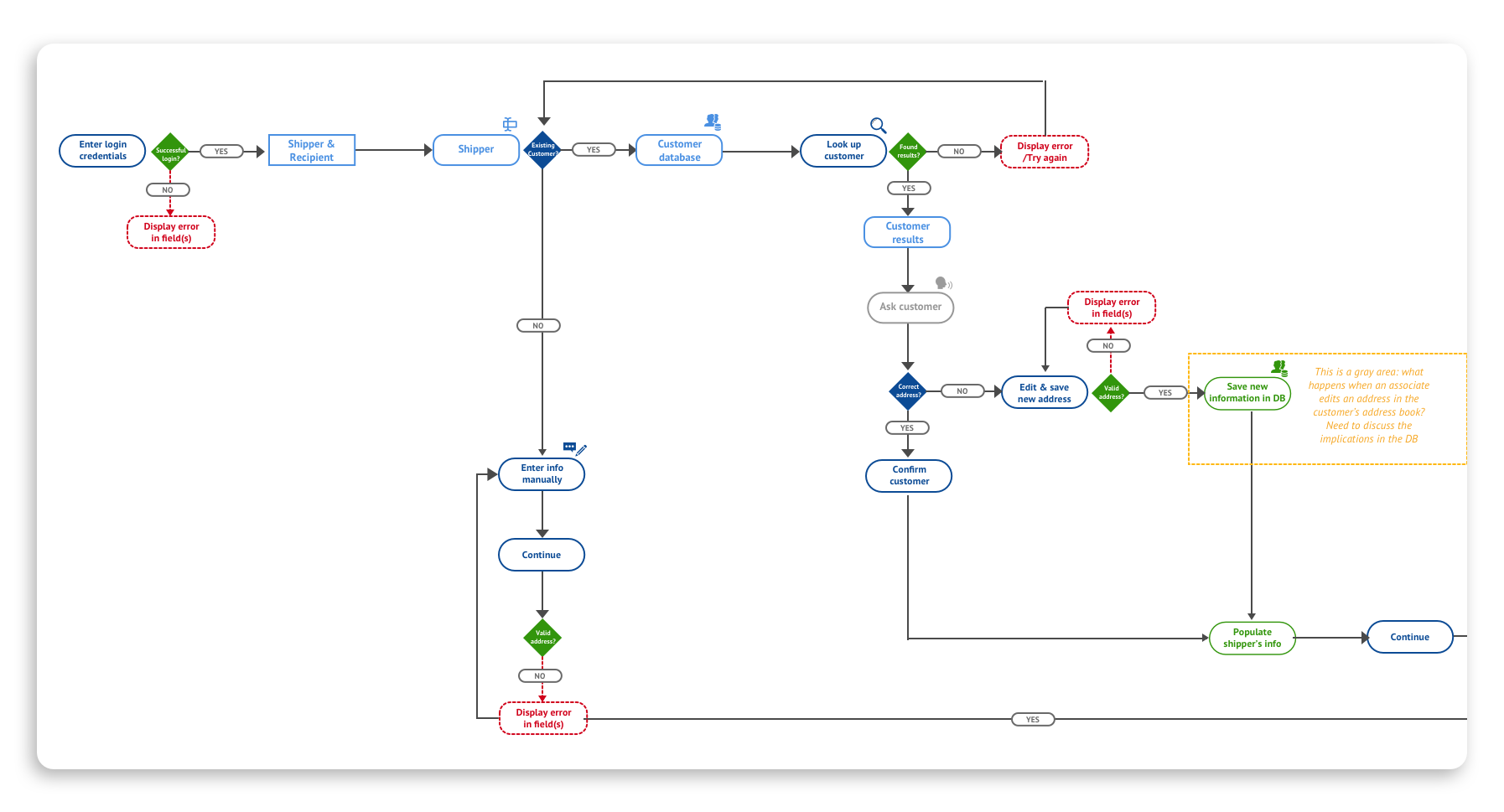
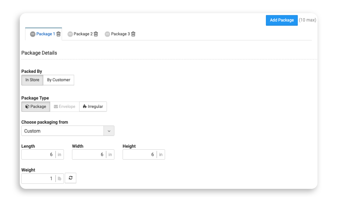
I started by creating a diagram to map the data users need to enter when making a shipping label. By grouping data that belonged together, I was able to see the amount of data required and decided that this process needed to be broken down into steps to make it more straightforward. The diagram also allowed me to understand how long some entry forms could be.
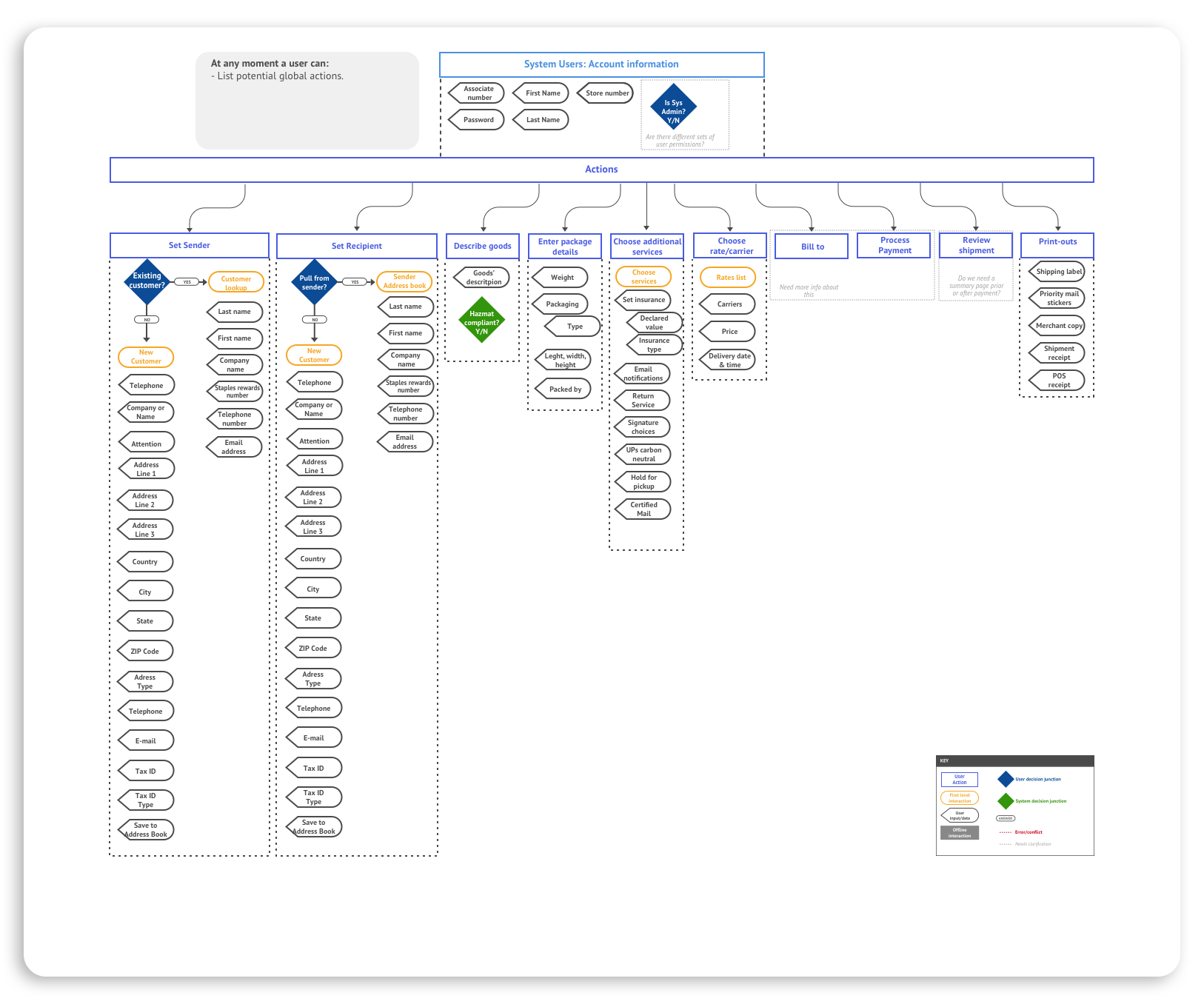
Then, I created a user flow to understand every interaction, both the associate’s and the system’s, and offline interactions between the associate and the customer. This flow also helped me map the errors, validations, and dependencies between steps to decide the order I would present them.
Decreasing training time
Associate positions in the Copy + Print area sometimes have high turnover rates. Managers reported that training associates to use the legacy tool took so long that sometimes they would leave the organization just as they became experts.
Stores had a binder with all sorts of training materials that managers annotated with their own experiences about troubleshooting the tool.
Here are some specific decisions that helped to decrease the need for training:
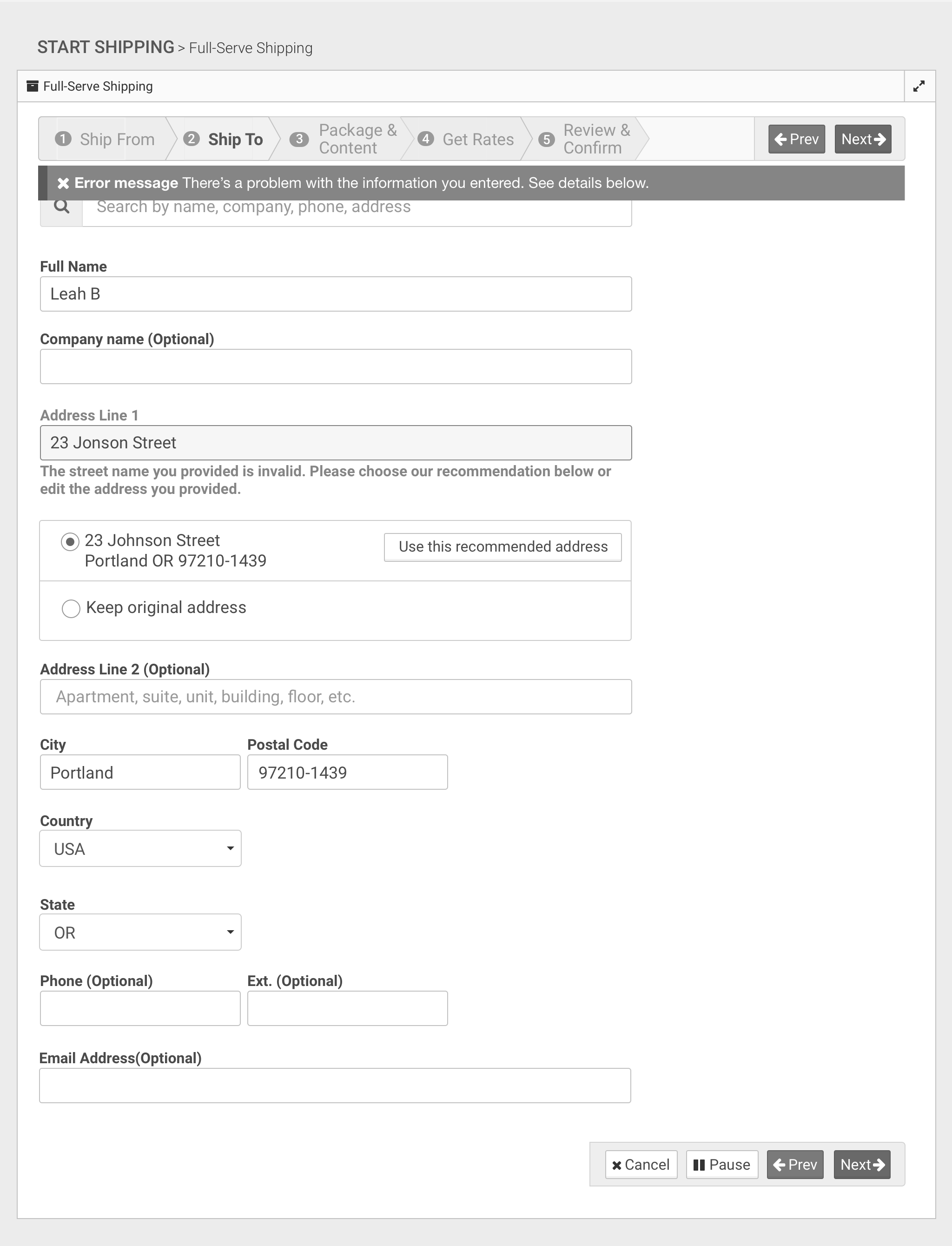
- I provided instant validations in forms, such as addresses, packaging, and additional services.
- Display clear errors with feedback along the way.
- Use progressive disclosure to show only relevant options.
Designed for multi-tasking
Associates in the Copy + Print area have to perform multiple tasks and work with many customers simultaneously. These are some decisions I made to help them with that:
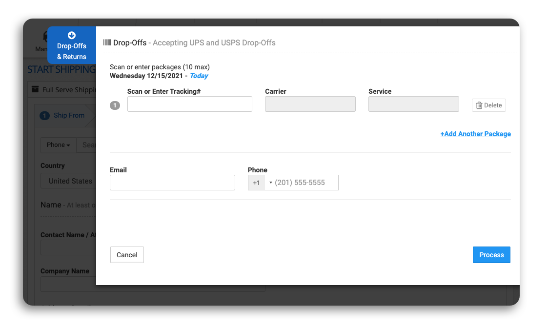
- They can process a drop-off at any point, even if they are in the middle of creating a shipping label.
- I designed a Customer Mode where associates can ask customers to enter their data for the first two steps in any computer at the Copy+Print section.
Designed to be carrier-agnostic
Even though Staples had a partnership with UPS only, I designed the application to onboard more carriers in the future. I did this by:
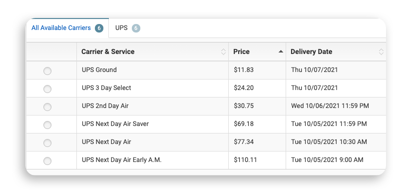
- Displaying carriers and rate selection at the end, so that package and additional services decisions define carrier options that will become available.
- Sorting rates by the lowest price provides the customer with the best value regardless of the carrier.
- I displayed carriers’ filters so associates could show them to customers who may have a preference or frequent customers.
Designed to scale
Given that the goal was to release the MVP shortly, the Product Manager decided to defer some features for a later phase, including international shipping and creating labels for multiple packages going to the same address.
However, when I was working on phase 1, I designed patterns that could scale, so we didn’t have to re-do as much later on.
Results
Product Highlights
- The team released Falcon’s MVP in all Staples stores across the United States within eight months.
- It generates over USD 35 million in shipping sales.
Post MVP Release
- I conducted usability testing with associates, and overall, the reactions were very positive. Therefore, I’m happy to report binders for training are no longer needed.
- During these sessions, I gathered insights for international shipments.
- Associates liked the customer mode and suggested making it available for customers to use on their phones instead of the Copy+Print section. This insight set the basis for what eventually became the customer-facing application.
- Since becoming a lead designer, I’ve helped the team release multiple other features for Falcon, including international shipments, shipping multiple packages, return services, and features specifically for Digital Production Facilities.