In short
As a manager, I led the product design team at Staples for four years in executing design solutions that help customers find the right product, choose the best options for their needs, and create print products online that print successfully.
I developed a robust design system with reusable CMS building blocks to support continuous testing and innovation across the platform.
Solutions delivered by the team included:
- Product configurator: lets customers choose product options while displaying transparent pricing and fulfillment options.
- Design builders: allow users to create print products from either a ready-to-print file or from scratch while preventing potential printing issues.
- Top-of-funnel pages: fully CMS-friendly for easy, frequent content updates without requiring development releases.
Selected impact
7%
YoY increase in conversion rate of category & product pages
4%
YoY increase in Average Order Value of category pages
8%
YoY increase in conversion rate of Upload your own design builder
Framing the problem
Staples’ Net Promoter Score (NPS) was 2 points higher for in-store orders than online orders, despite identical production standards. While associates guide customers effectively in stores—helping them with design, and select products and options—the online experience lacked information and didn’t inform about potential quality issues, leading to mismatches between what customers saw on screen and final printed results.
This also created in-store inefficiencies; associates spent excessive time resolving issues and communicating with customers, causing delays to pick-up times, and increasing frustration for both customers and associates.
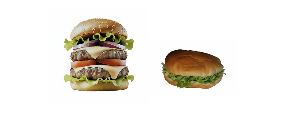
The Staples print website had a big expectations-versus-reality problem.
With this context, we learned that customers wanted to:

Find the right product, sizes, and materials for their needs earlier in the flow

Understand how different options impact pricing and fulfillment

Avoid potential printing issues and preview their final product
Understanding the full journey
Quantitative data showed users stopped using the site at two key points: when finding a product and while customizing their design. While the upsell page worked well in getting customers to the cart, usability testing and customer interviews revealed it gave too much information after they had already spent time uploading a file or customizing a design—making it harder for them to make smart choices.
Making it easy to choose the right options
Our hypothesis was that displaying product options earlier would help customers make better decisions, but we recognized two key challenges: architectural changes to the site and the risk of introducing friction early in their journey.
To mitigate these risks, we:
- Designed and validated user flows with developers.
- Tested a prototype with real users for feedback before finalizing implementation.
- A/B-tested posters first, scaling to additional products only after proving measurable success
What you see is what you get
To address customer frustration when designs failed in print despite looking good on-screen, we needed to consider two sets of users, those who come:
- To design a product from scratch, or
- With a ready-to-print-file
Customers who use the Staples print site to create a design, experienced common issues like margin/bleed errors, small fonts or cut-off elements.
I led initiatives within our dedicated design builder portfolio to implement protective guardrails, such as: warnings, interaction prompts, AI resolution enhancement, etc.
For those those customers who are already prepared with print-ready files, we designed an optimized upload builder that prioritized speed—showing a configurator preview of product options (sizes, materials, finishes, and accessories) without requiring design customizations.
Collaborative content redesign
To redesign the homepage, category, and product pages, I first established a content strategy through workshops held in 2–3 sessions per page, each involving 6–8 participants, including directors, product managers, marketing specialists, designers, and CX specialists. By aligning customer research insights with marketing, business, and SEO priorities during these sessions, I ensured alignment before moving on to wireframing and prototyping.
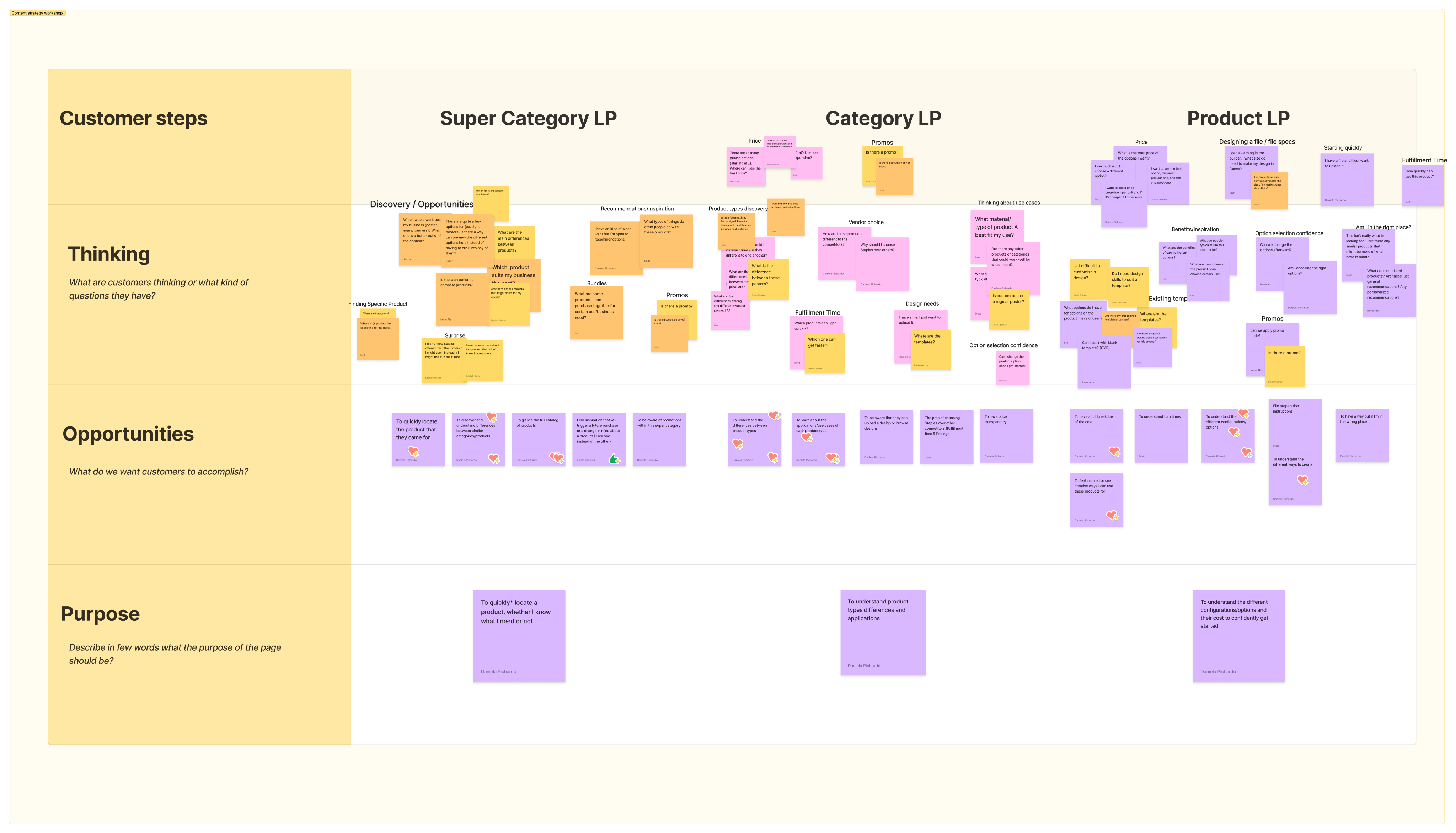
Content strategy workshop
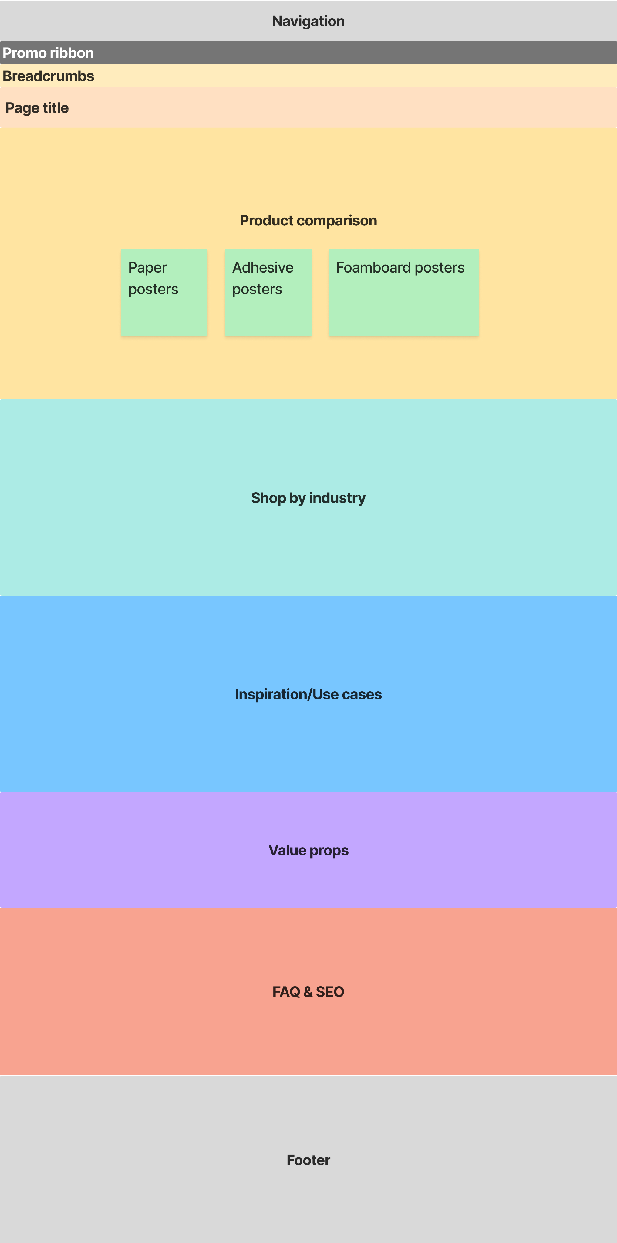
Early wireframe
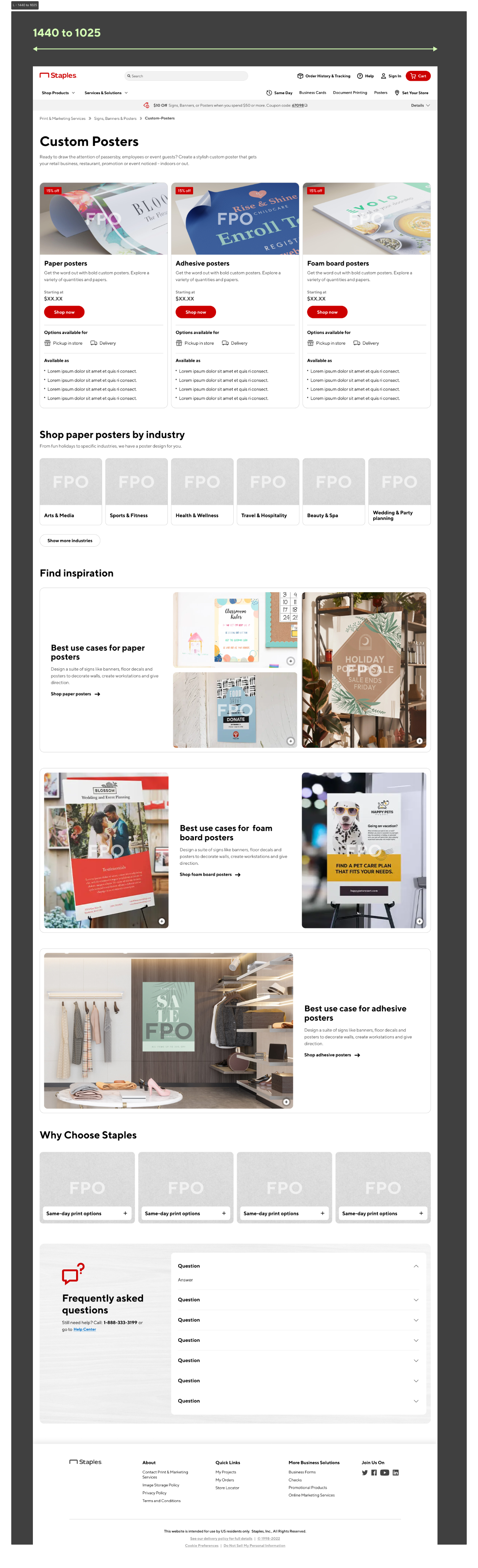
Mockup with placeholders
Build it once, use it many times
To maximize flexibility without requiring development releases, I led our design team in the creation of modular CMS components that were fully responsive for tablet and mobile breakpoints.
I developed a design system in Figma that enabled dynamic swapping of variants and a framework to maintain it. I did this through brainstorming sessions with designers and structured feedback loops across multiple iterations.These components allowed teams to turn elements on/off in both our design system and the CMS to test different UX hypotheses or update marketing content effortlessly.
Designing with intention creates lasting impact
To design an online service that feels as reassuring and guided as an in-store consultation, we couldn’t focus only on aesthetics–it required deep knowledge of customer needs and listening to what associates were reporting.
Our design decisions ultimately helped increase the NPS score of the online experience year-over-year, reducing friction, building trust, and creating seamless journeys that aligned with both customer needs and business goals.
Moving forward, I’ll continue to advocate for these principles to create products and services users love—and businesses thrive on.
Explore some examples the impact made on the top-of-funnel pages and top navigation:
Super category page
Homepage
Top Navigation (mobile)
Before
After